
Hungry + kind
Words + images
Graphic designer
Art director
Wild
Draws hella good
Words + images
Graphic designer
Art director
Wild
Draws hella good
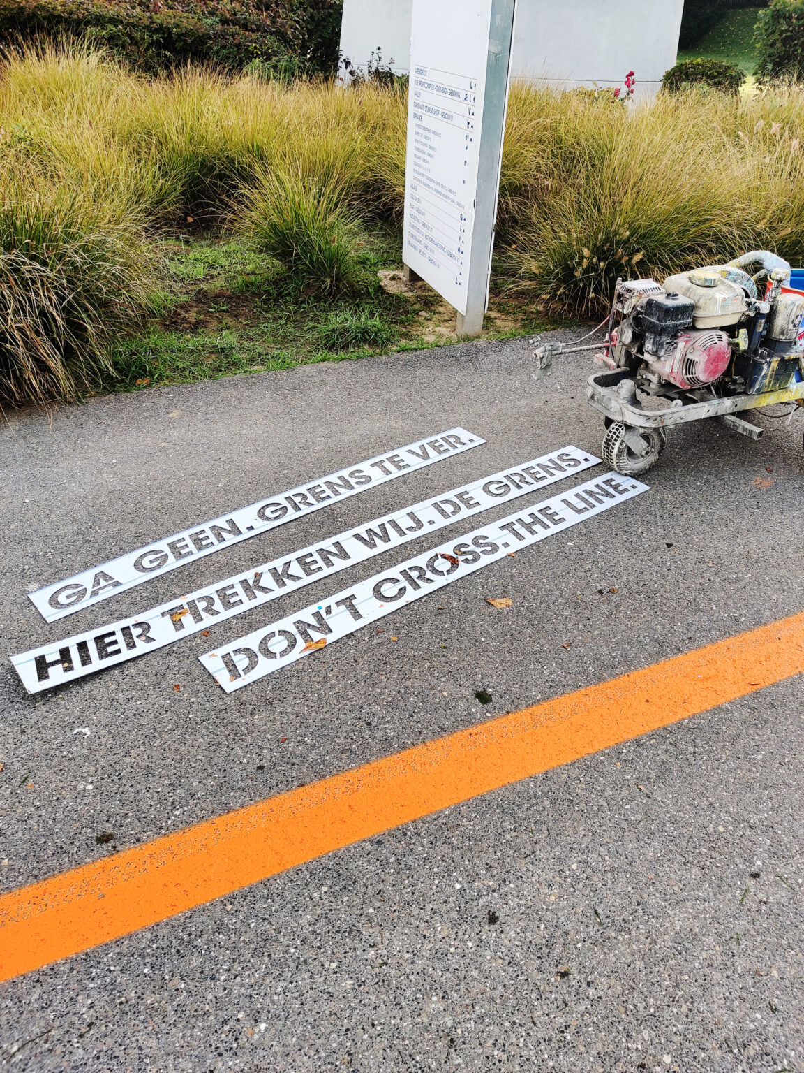
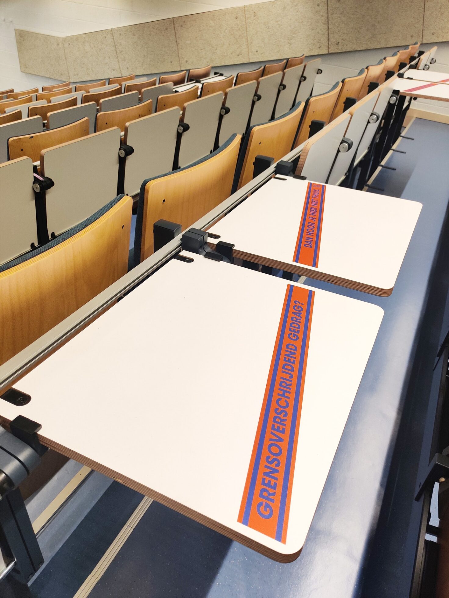
Campaign (VUB)
During my stay at Josworld, VUB asked us to design awareness campaign to publicise and address their new policy on transgressive behaviour!

By literally spreading the message throughout the campus, from grounds and student rooms to auditoriums and toilets, we wanted to enable the VUB community to make a powerful statement physically and symbolically. Thus, the issue could not be ignored and was embedded in all aspects of campus life, emphasising the importance of taking action against transgressive behaviour.

Question booklet (Beeldenstorm)
How do you make a questionnaire accessible to a public that often doesn’t have Dutch as a first language?
Beeldenstorm gives artistic courses to a varied public. To prove this when requesting funding, they need data. Lots of data. So every participant gets to fill in a list of questions that comes in the form of a booklet, one that was horribly outdated, and often not very suited to the realities of the people filling it in.
It’s not a nice feeling to get questions you can’t understand or are unable to answer because your situation doesn’t fit, and filling the booklet is the one of the first things people get to do when they start the courses, so I really wanted it to make sure it felt welcoming and considerate.

We listened to the difficulties teachers, participants and the administration had with the booklet, and which solutions they proposed. We noticed a lot of questions remained unanswered, in part because people struggled to understand them. I rephrased the questions so they are easier to clear, easy to answer, and yield the information needed. Then I translated them to French :)

I made a new layout that uses the house font, but in a way that makes the pages feel lighter and more structured, while still using less pages, so the booklet feels a lot less intimidating.
For the illustrations I went with a style that suits that lightness and is playful and easy to emathize with.

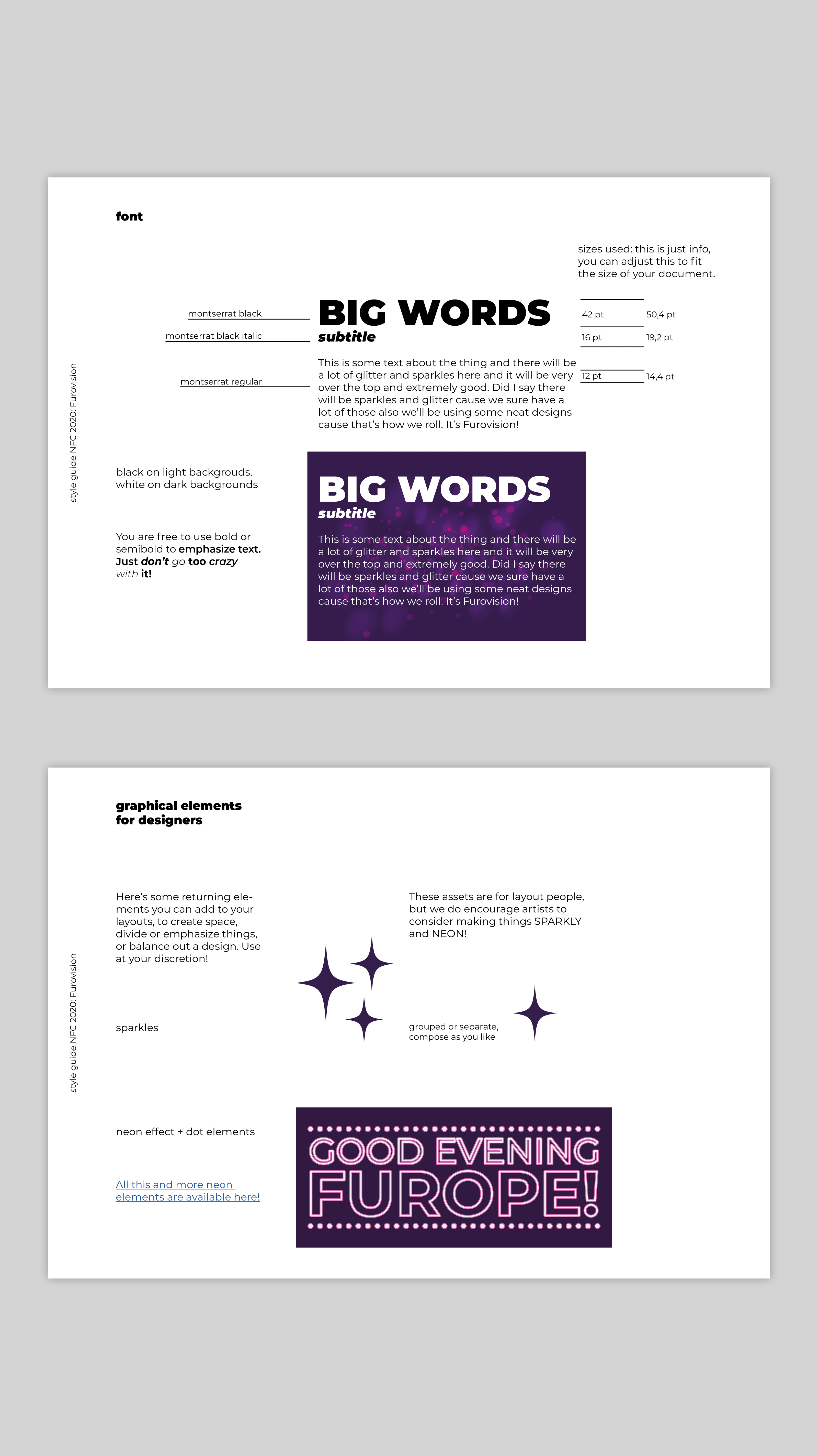
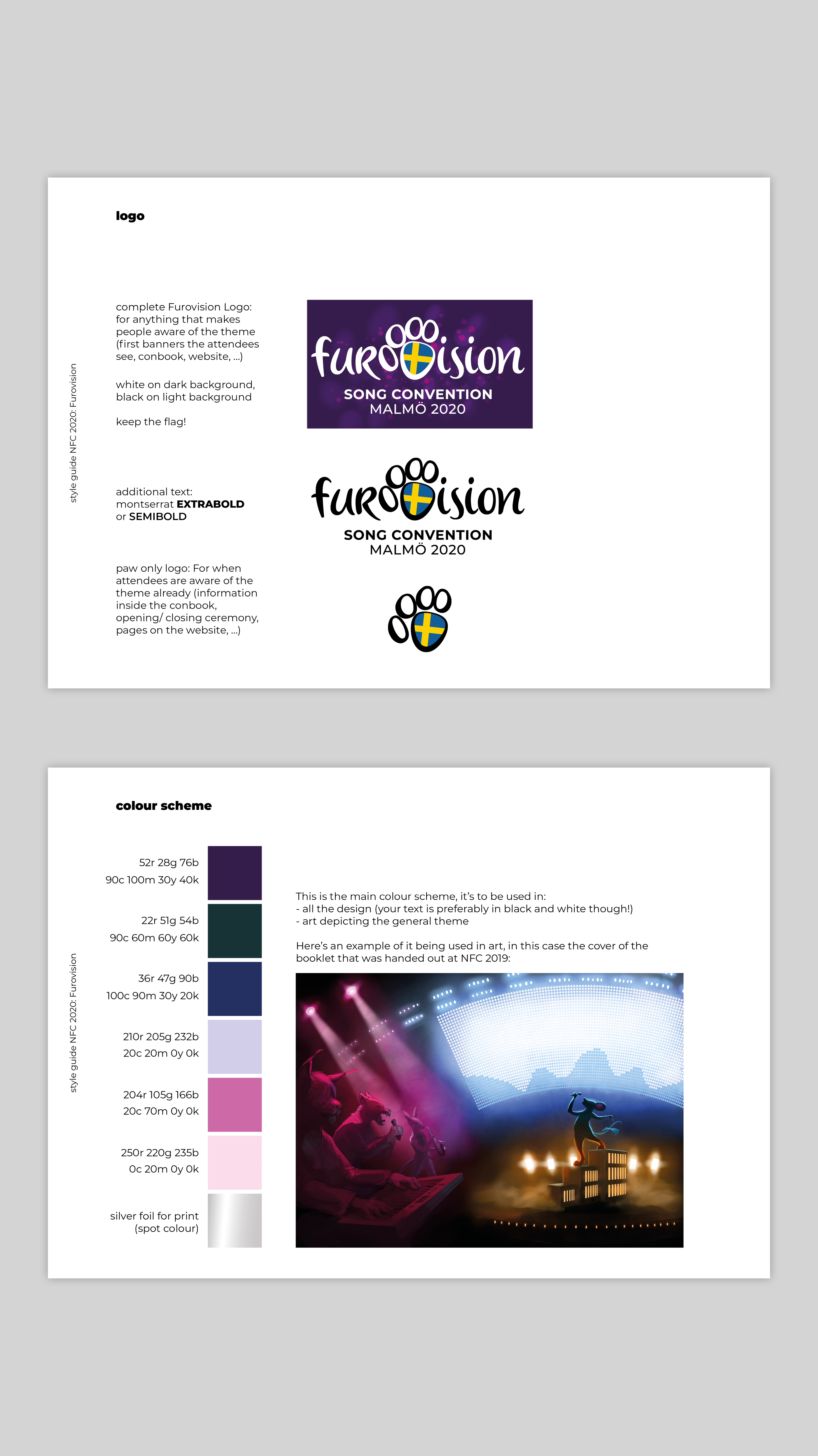
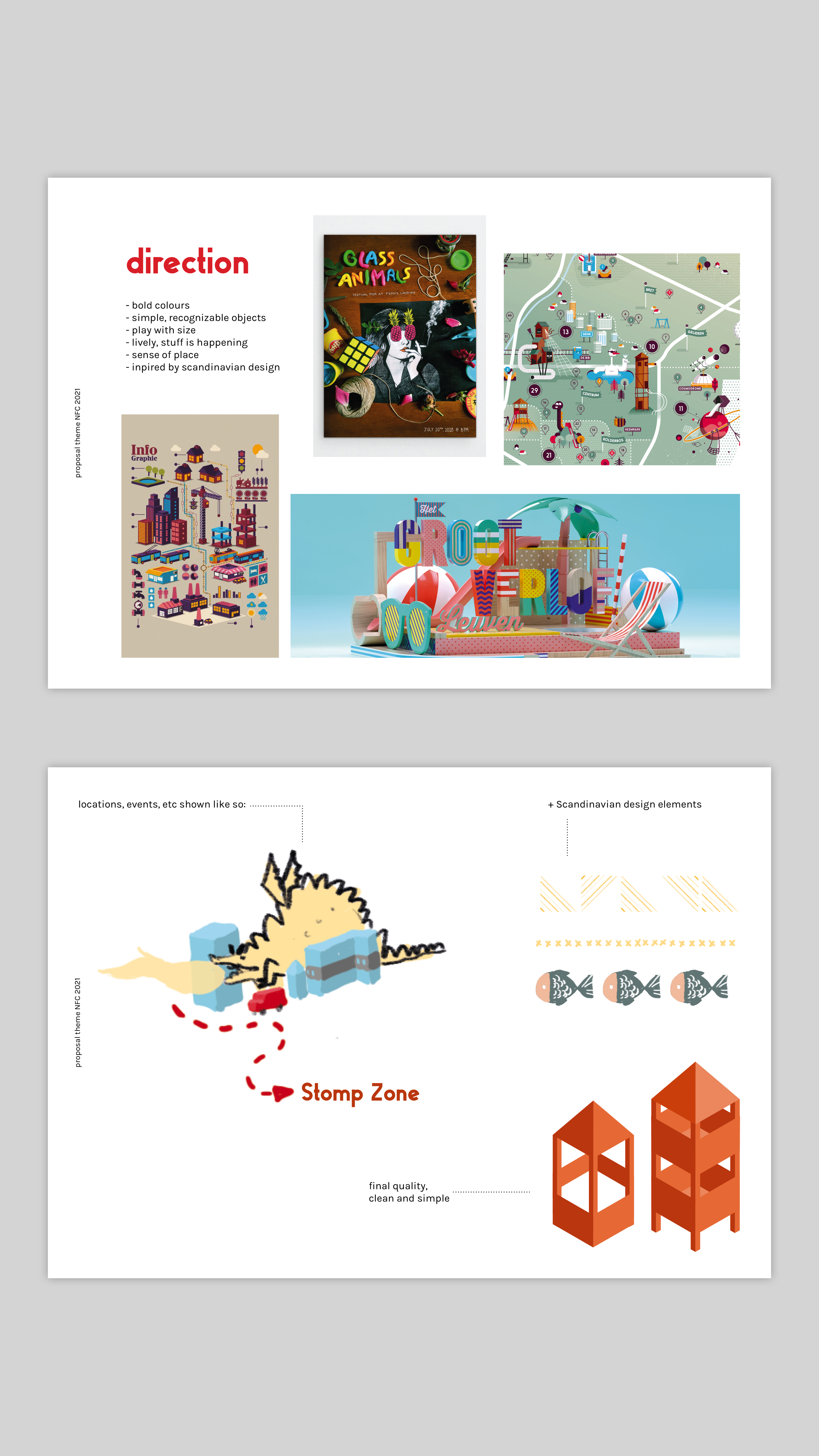
NFC
I volunteered as an art director and designer for Nordic Fuzzcon, an art convention in Sweden.
I lead a design team together with the other art director,
do conceptual work, and handle communication with the internal clients.
We worked with the organizers in a way that was new to them, instead of merely delivering requested designs, we asked were they really wanted to take their yearly themes and what kind of experiences they wanted to share, and then built a visual approach from there.
Here’s two styleguides I made for them:

Magazine (self)


I used the work of illustrator Meg Hunt as a starting point to experiment with (art)magazine layout. Since her work is the main topic, I chose to use the images to lend structure to the page layout.
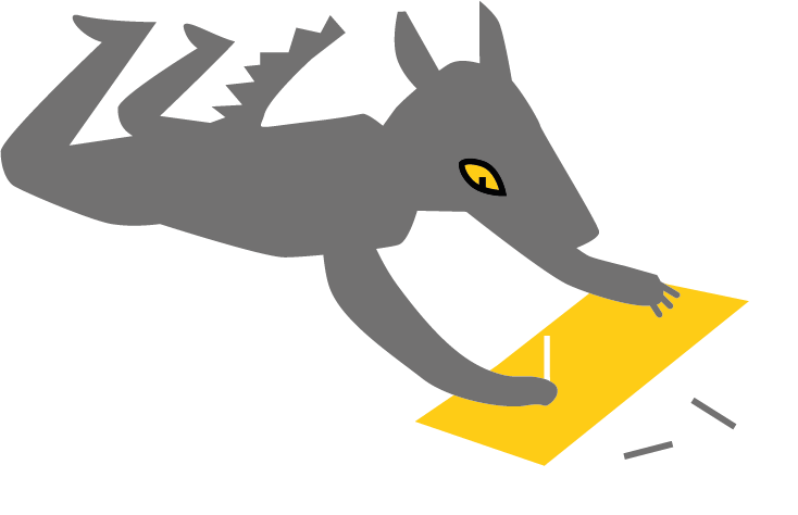
Vuurwerk campagne (stad Genk)
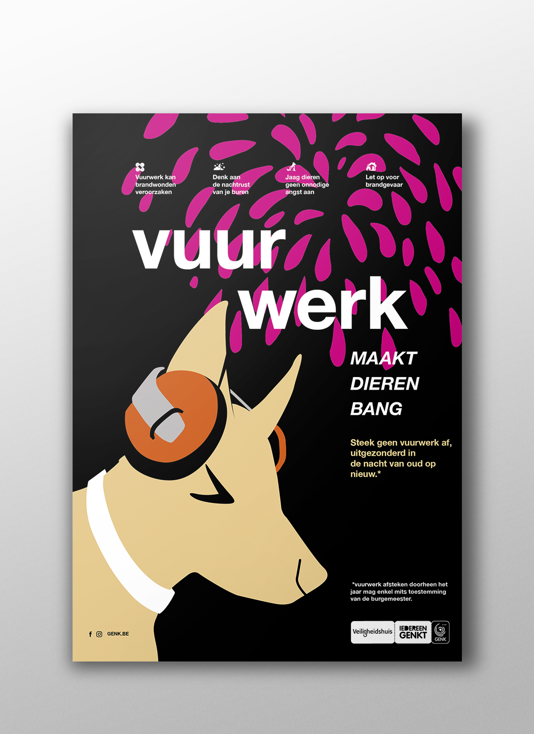
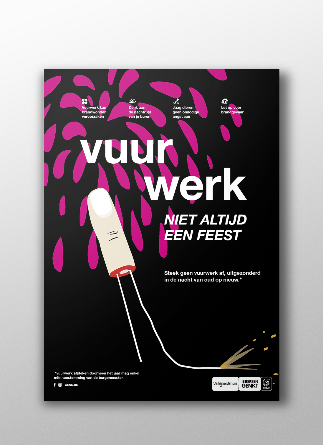
For the safety departement of stad Genk. The client asked for imagery that was explicit and discouraging and that showed the negative effects of careless use of fireworks. We chose to use illustration rather than gruesome imagery.